I took up watercolors a few months ago. I started with very nice videos by Jacques Williet. I would warmly recommend his tutorials to French speakers because the videos are really focused on the artwork being created, and because the artist explains color choices as he goes. As a bonus, the calm tone of voice and soothing jazz music turn each video into a spa-worthy relaxing experience.
First steps
The first time that I got my watercolors, I embarked on painting a photo from my holidays in Étretat. As you can see, it doesn’t look much like watercolor.
At first I was putting too much paint and the result looked like gouache.
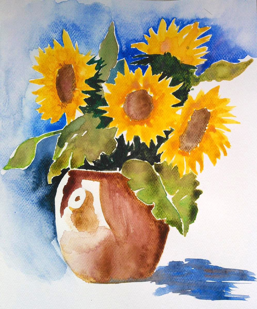
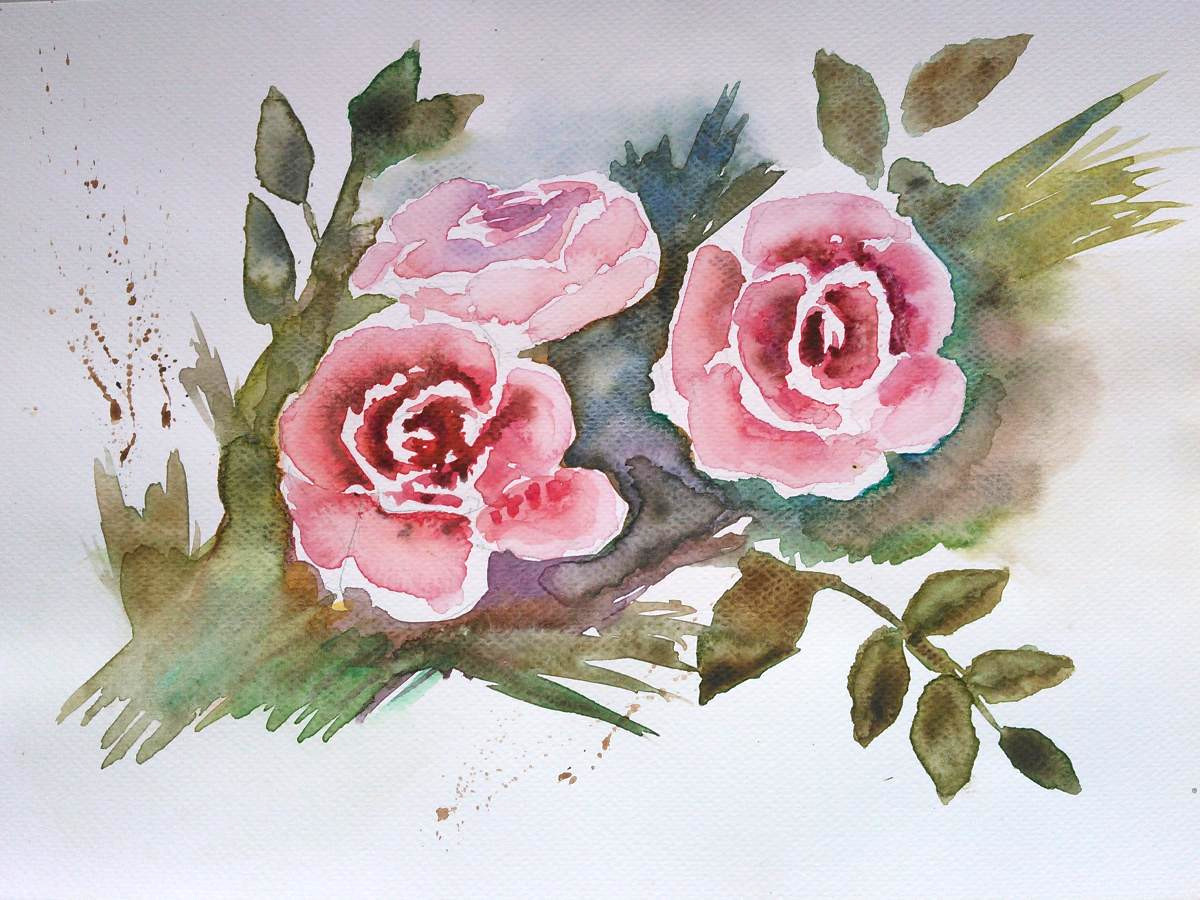
After that I started to reproduce some of the tutorials by Jacques Williet, namely the sunflowers, the roses and the sunset. I did not try to do the best I could every time, in the sense that I painted quite fast and did not care much about the details. You can see that mostly on the sunflowers: the petal are messy, and the dark green that went in-between doesn’t quite fill the holes between the flowers. But anyway, I enjoy watercolor for that reason: I can work roughly an hour and have a result at the end.
Most things are off with this bouquet: the blue in the background and the pot’s color are dirty, the shadow looks out of place and the flowers could be said to be blurry by a benevolent critique. Also, the shadows in-between the flowers take up too much space. Check out the original video.
Compared to Jacques Williet’s video, my roses’ petals are not as crisp, probably because I did not focus on “coloring the shadows that petals cast on each other”. Also, just like the sunflowers, the darker area in the middle is too large and features an unwelcome bubble-like pattern left by an excess of water after it dried.
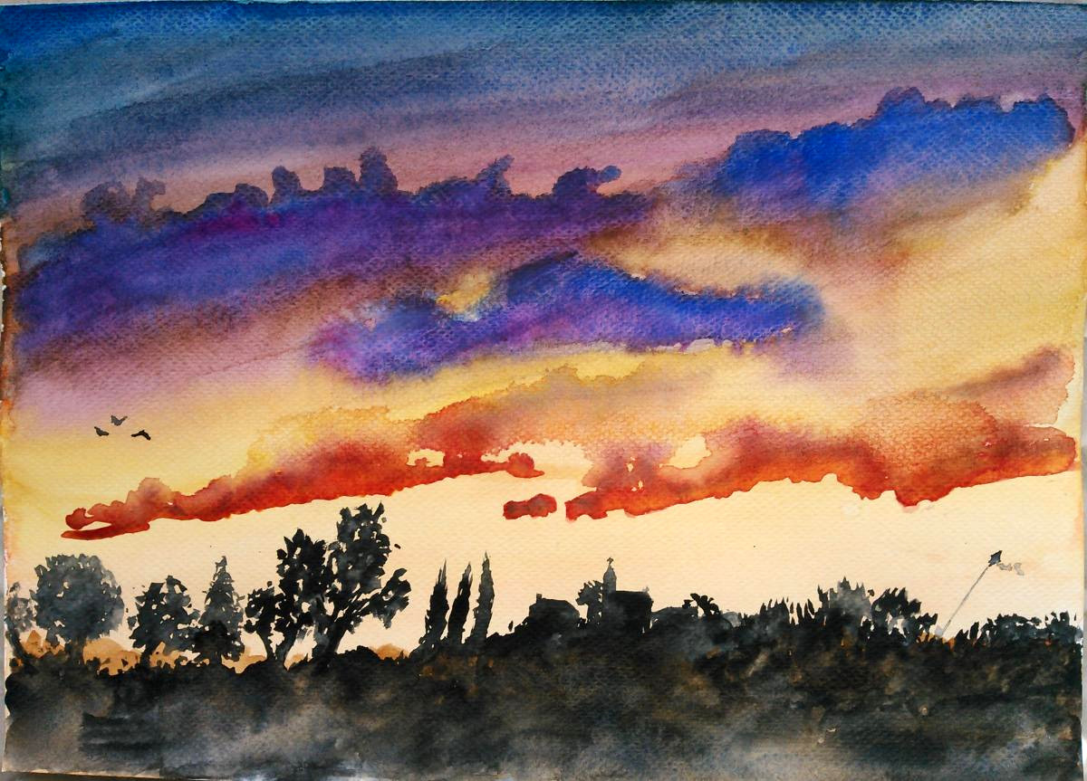
I’m rather happy with that last one, apart from the fact that the dark landscape at the bottom is too high and mostly hides a clever technique from the tutorial video: we paint a first lighter background at the bottom, let it dry, and then add over it the Payne’s gray foreground.
In the end, my sunset watercolor is quite different from Jacques Williet’s, more than anything it has far fewer details, in the clouds and in the landscape. That’s part of my plan to keep watercolors enjoyable by doing short sessions.
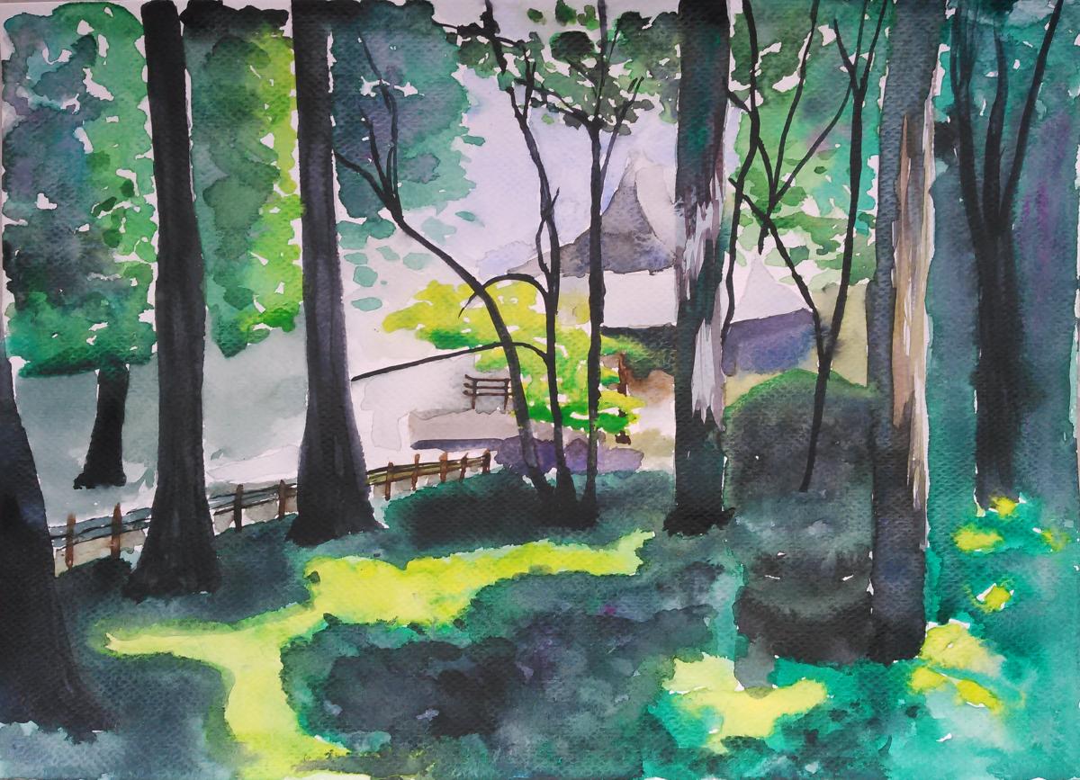
I also tried doing something on my own, from a photo of the Sanzenin garden in Japan. Again I think that I put a bit too much paint.
Materials and tools
This plastic box is convenient because it’s small enough to be taken on a trip and used outside (there’s a handle on its underside).
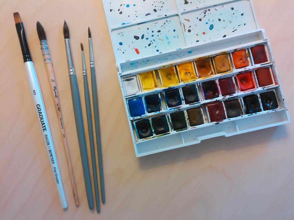
I started with 12 half-pan set from from Lefranc & Bourgeois, featured in the above picture. After the first few YouTube tutorials, I went back to the art supplies shop, Rougier & Plé, looking for a half-pan of Caput Mortuum, which I bought along with a new brush and a new paper block.
Now I look at clouds differently.
To have more colors, I ordered from Amazon a huge Winsor & Newton “Cotman” Studio Set watercolors palette, with 45 half-pans, because it was cheap: only 38€ at the time. I completed my 24-slot palette with 11 colors from the Cotman set, plus 1 half-pan of Caput Mortuum from Sennelier. I’m very happy with the final setup: I have enough colors and I can carry them around easily. I recommend the Cotman set because it’s comprehensive and cheap. Although I heard/read that the quality is not the best (the grade of the Cotman colors is only “fine”, instead of “extra fine” for the traditional Winsor & Newton colors), I didn’t feel that it was a problem for a novice like me.
As for paper, I was advised to start with the cheapest paper in the store, which weighed 250 g/m² and had the regular “dotted” grain that you can see in this post’s paintings. I don’t recommend it. I recently bought a Canson paper block at 300 g/m² with a softer grain, which was only slightly more expensive, (mid-range product) and it already feels a lot better to work on.
Finally, for brushes: I was also advised to start with the least expensive brushes, as long as they were made from natural hair. “Petit gris” is the cheapest natural kind of brushes. I bought 3 simple round brushes of various sizes (the gray ones in the picture). On my second visit to the art shop, another salesperson recommended the Raphael quill mop brushes (pinceaux à lavis in French) and it was the best piece of advice ever. I bought only a small one (with the wooden handle, second from the left in the picture), but I’m definitely going to get a second, larger one soon. This brush is magical in two ways:
-
The piece of plastic held with metal strings acts as a reservoir, which allows the brush to hold more water. You can easily achieve gradients for example, if you only put paint on the tip of the brush and slide it laterally. Also you don’t have to dampen it again so often.
-
The pointy arrangement of the hairs allows to get varying stroke widths very easily, and give a more “dynamic” feeling to leaves or petals for examples, such as the sunflower petals in the video.
I also got a very cheap synthetic flat brush for details. That’s what I brought with me to New York City last month, to make my first carnet de voyage!
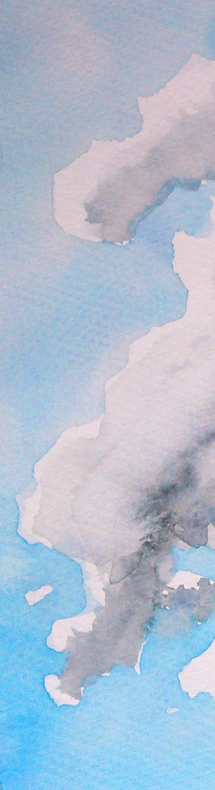
A morning sky
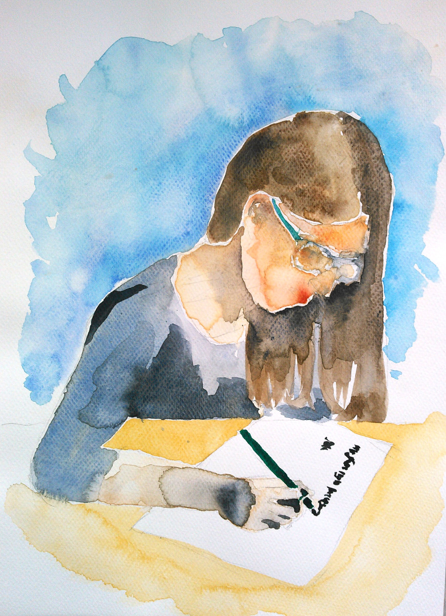
Practicing calligraphy
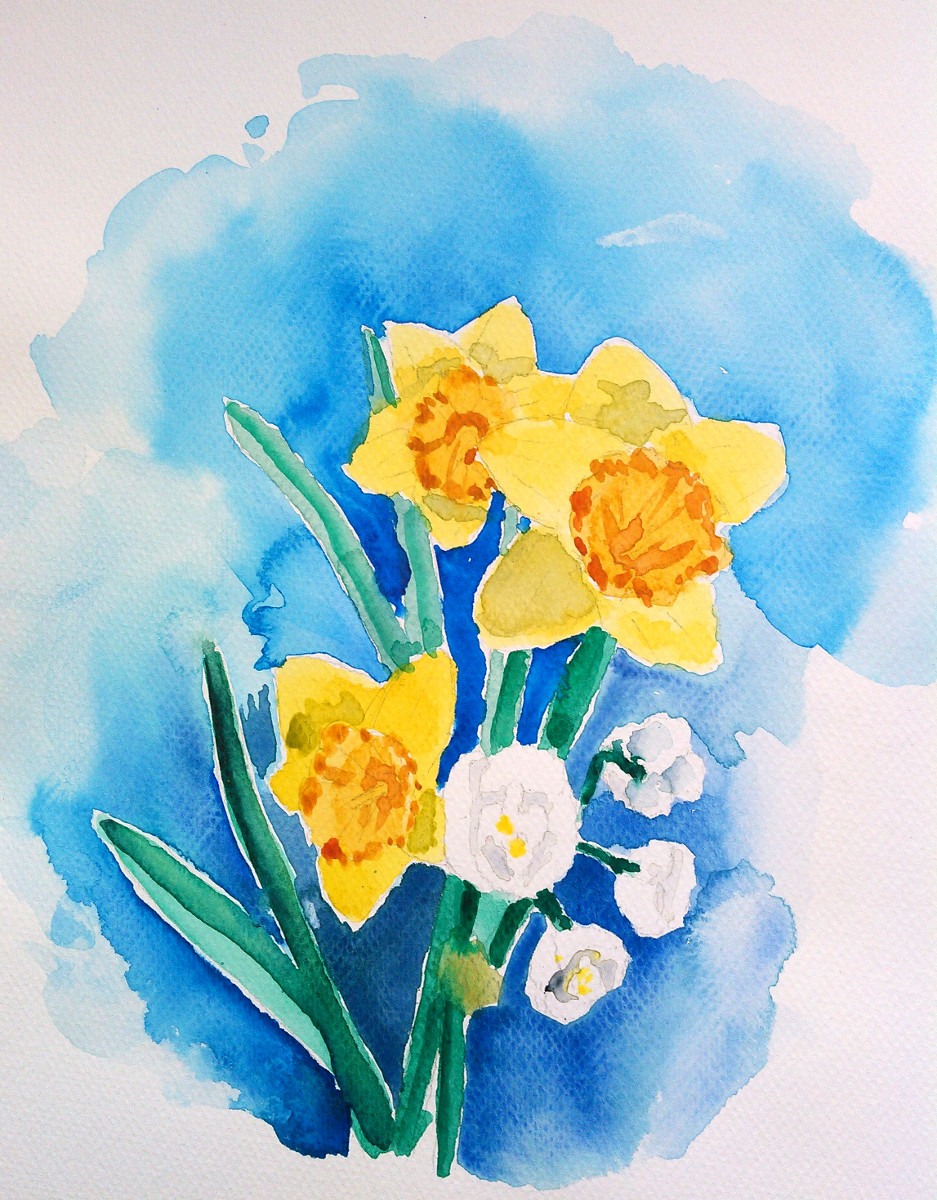
Some daffodils
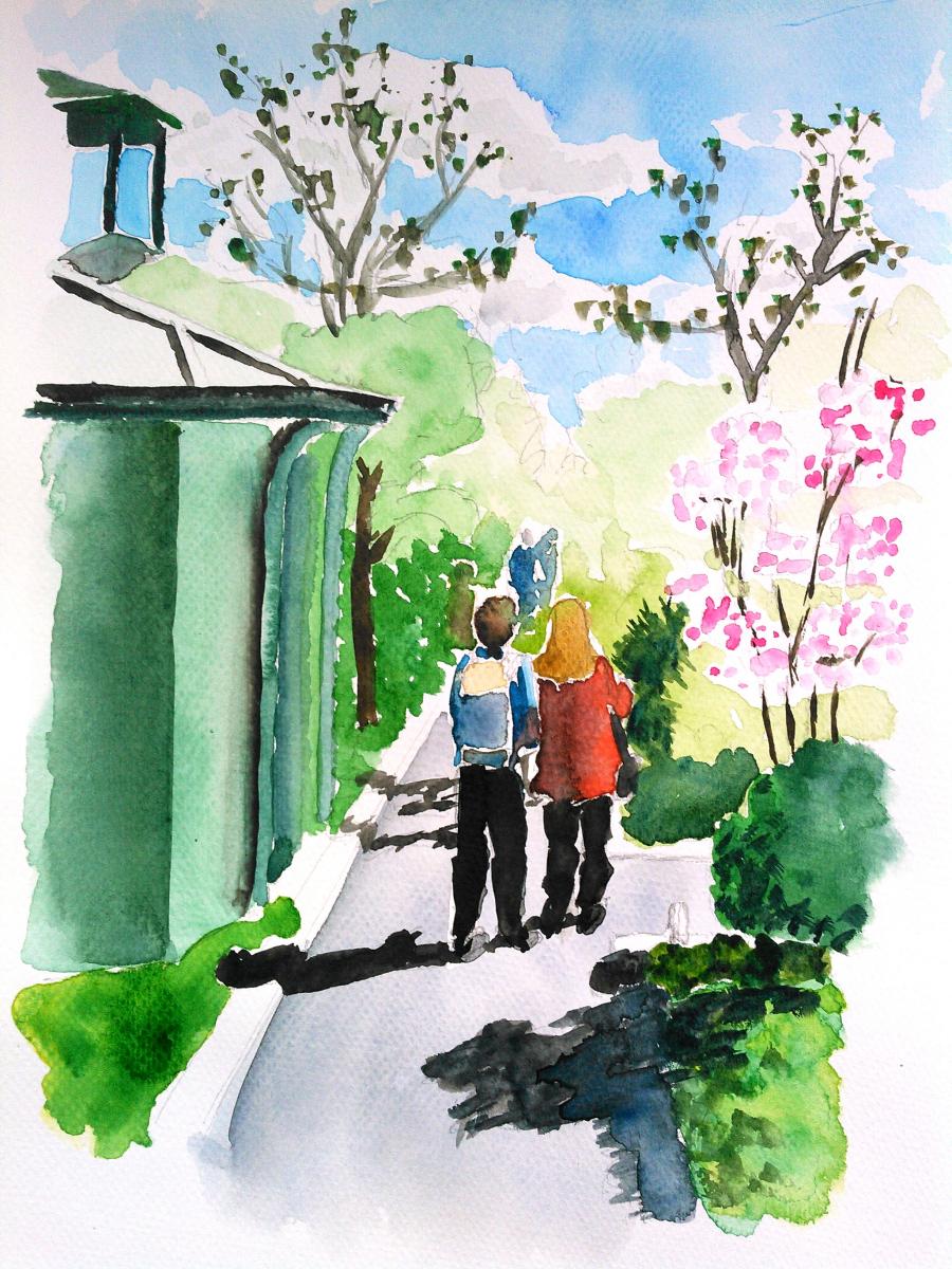
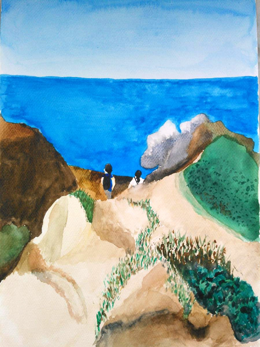
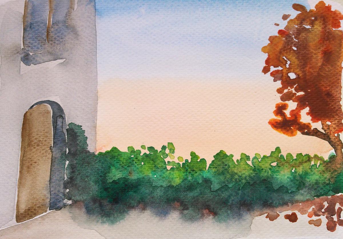
Above: two friends strolling in the Coulée Verte Walk in Paris.